
Navigating the ever-evolving landscape of web design can feel like paddling upstream in a rapidly changing current. One day, you’re confidently structuring layouts with CSS Flexbox, and the next, you’re hearing whispers about the unparalleled power of CSS Grid. This endless shuffle between technologies presents a common dilemma: How do you know which tool is truly right for the job at hand? Have you ever found yourself frustrated by the limitations of one layout technique, only to realize that the other could have solved your problem more efficiently?
In our quest to create robust, responsive designs, we often debate the merits of CSS Grid vs. Flexbox. Are you overwhelmed by the sheer volume of conflicting advice and complicated tutorials? You’re not alone. Many developers struggle with the nuances of each approach, wondering how to wield these powerful tools to their fullest potential without getting lost in the weeds.
This article aims to demystify the complexities surrounding CSS Grid and Flexbox. We’ll delve into their essential techniques, offering practical tips and real-world scenarios where one may shine brighter than the other. Whether you’re working on a personal project or tackling professional challenges, understanding how to effectively combine these two powerhouse tools could be the key to unlocking smoother, more efficient workflows. So let’s embark on this investigative journey together, breaking down the barriers to mastering your CSS layout with confidence and clarity. Ready to find out which technique will reign supreme in your next project?
Table of Contents
- Understanding the Core Differences Between CSS Grid and Flexbox
- Optimizing Layouts: When to Choose Flexbox Over CSS Grid and Vice Versa
- Advanced Techniques: Achieving Complex Layouts with Combined CSS Grid and Flexbox
- Troubleshooting Common Issues in CSS Grid and Flexbox Implementations
- Performance Considerations: How CSS Grid and Flexbox Affect Page Speed
- Responsive Design Strategies: Best Practices for Using Grid and Flexbox on Various Devices
- Streamlining Your Workflow: Helpful Tools and Resources for Mastering CSS Grid and Flexbox
- Wrapping Up
Understanding the Core Differences Between CSS Grid and Flexbox
When diving into the sophisticated world of CSS layout techniques, two powerful tools stand out: CSS Grid and Flexbox. Both offer unique advantages, but understanding their core differences assists in making informed decisions during web development.
Layout Philosophy
CSS Grid is a two-dimensional system, allowing for the creation of complex layouts spanning both rows and columns. Imagine a spreadsheet where each cell can be precisely defined – that’s the grid’s power. On the other hand, Flexbox excels with its one-dimensional approach, managing items along a single axis – either row-wise or column-wise.
For instance, when working on a responsive photo gallery for a client project, I leveraged CSS Grid to create seamless, adaptable layouts. Flexbox, however, was crucial in ensuring equal spacing and alignment of individual image thumbnails within a row.
Use-cases and Best Practices
CSS Grid comes into its own when you need a layout involving multiple elements that interact in more than one dimension. A great example would be creating a complex website structure with headers, footers, main content areas, and sidebars.
Conversely, Flexbox shines in simpler, linear arrangements. For example, centering navigation bars, aligning form inputs, or distributing space among buttons are situations perfectly suited for Flexbox. Consider its automatic space distribution capability: Flexbox simplifies stretching elements to fit their container, which I found indispensable while designing a dynamic form for an e-commerce site, ensuring optimal alignment across devices.
/* CSS Grid Example */

.container {

  display: grid;

  grid-template-columns: repeat(3, 1fr);

  grid-gap: 10px;

}


/* Flexbox Example */

.flex-container {

  display: flex;

  justify-content: space-between;

}
Performance Considerations
Both techniques are optimized for performance, but the choice between them can impact page rendering efficiency. Since CSS Grid handles more complex layouts effortlessly, it may introduce more overhead in calculation times for certain browsers compared to the streamlined Flexbox model.
Combining Grid and Flexbox
Often, the most effective layouts mix both technologies. Take a common scenario of a dashboard: Grid might outline the overall structure whereas Flexbox refines the positioning and uniformity within those grid containers. This combination was particularly beneficial in a project management tool, where we arranged widgets within a grid layout and used Flexbox to ensure responsive content flow.
To encapsulate, while CSS Grid provides unparalleled control over complex, two-dimensional layouts, Flexbox ensures flexibility and ease of alignment on a single axis. By mixing these powerful methods judiciously, you can build impeccably responsive and visually consistent interfaces. How you wield these tools should align with your specific project goals and design ethos.

Optimizing Layouts: When to Choose Flexbox Over CSS Grid and Vice Versa
Choosing between Flexbox and CSS Grid can be quite the conundrum. Both are powerful tools with unique strengths, and deciding when to use each can transform your web-layout skills. Here are in-depth guidelines to help you make the right choice for various scenarios.
Flexbox: Best for One-Dimensional Layouts
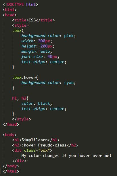
Flexbox excels in scenarios where you need a single-direction layout. It’s perfect for organizing elements either in a row or a column but not both simultaneously. For instance, if you want to center items within a navigation bar, Flexbox allows you to do it effortlessly.
Step-by-Step Example: A Horizontal Centered Navigation Bar
-
HTML Structure:
-
CSS Styling:
.flex-nav {

    display: flex;

    justify-content: center;

    background-color: #333;

}

.flex-nav a {

    color: white;

    margin: 0 15px;

    text-decoration: none;

}
In one of my projects for an e-commerce site, I used Flexbox to create a dynamic product list where items adjusted fluidly across different screen sizes with minimal effort. The same principle can be used for footers, sidebars, and any linear layouts.
CSS Grid: Best for Two-Dimensional Layouts
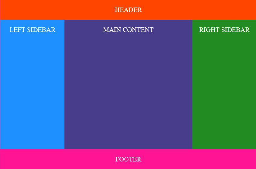
If your design involves complex, two-dimensional layouts with both rows and columns, CSS Grid is your go-to tool. For example, a full-page layout with header, sidebar, main content, and a footer can be elegantly completed with CSS Grid.
Step-by-Step Example: Full-Page Layout
-
HTML Structure:
Header
Main Content
-
CSS Styling:
.grid-container {

    display: grid;

    grid-template-areas:

      "header header"

      "sidebar main"

      "footer footer";

    grid-gap: 10px;

}

header { grid-area: header; }

.sidebar { grid-area: sidebar; }

main { grid-area: main; }

footer { grid-area: footer; }
In another project, I used CSS Grid to create a magazine-style layout where articles of different sizes were displayed in an aesthetically pleasing grid pattern. Grid’s ability to handle complex layouts seamlessly is unparalleled.
Choosing Flexbox and CSS Grid Together
In many cases, combining both can yield the best results. Use CSS Grid to set up the overall page structure and Flexbox to refine the positioning of elements within those grids.
Example Scenario: Complex Form Layout
-
HTML Structure:
-
CSS Styling:
.grid-form {

    display: grid;

    grid-template-columns: 1fr 2fr;

    grid-gap: 10px;

    align-items: center;

}

.btn-group {

    grid-column: span 2;

    display: flex;

    justify-content: space-between;

}
Using techniques from the article, I revised a form layout for a client, significantly enhancing the user experience by leveraging both Flexbox for button alignment and CSS Grid for overall form structure.
As a result, the form became more intuitive and easier to navigate, proving that the thoughtful application of both Flexbox and CSS Grid can enhance usability.
Balancing the use of these tools allows you to craft layouts that are not only visually appealing but also highly functional, thereby turning user interface challenges into smooth, seamless experiences.
Advanced Techniques: Achieving Complex Layouts with Combined CSS Grid and Flexbox
When developing intricate and dynamic layouts, leveraging both CSS Grid and Flexbox can be a game-changer. While CSS Grid excels at creating the overall structure, Flexbox shines in managing the finer details within individual grid items. Combining these two techniques effectively addresses various pain points such as responsiveness, alignment issues, and consistent spacing, which are common hurdles in front-end development.
Utilize CSS Grid for Overall Structure
CSS Grid allows you to define your layout in two dimensions—columns and rows. Begin by setting up your grid container:
.container {

  display: grid;

  grid-template-columns: repeat(3, 1fr);

  grid-gap: 20px;

}
With this setup, you’ve created a three-column layout where each column shares equal width. From here, you can control the placement of each grid item. For example:
.item1 {

  grid-column: 1 / 3; /* spans across the first two columns */

}

.item2 {

  grid-column: 2 / 4; /* starts at the second column and spans to the end */

}
This method offers substantial flexibility and precision in placing your elements exactly where you need them.
Enhance Individual Grid Items with Flexbox
Within each grid item, Flexbox becomes invaluable for aligning and distributing space among its child elements. For instance, if a grid item encompasses multiple cards that need uniform alignment, Flexbox can simplify this:
.item1 {

  display: flex;

  justify-content: space-between;

  align-items: center;

}
Here, justify-content: space-between; ensures that the items are evenly distributed, with equal space between them, while align-items: center; vertically centers the elements within the container.
Practical Application in Projects
In one of my past projects involving a complex e-commerce product page, I creatively combined CSS Grid and Flexbox to achieve a responsive, highly-organized layout. The grid defined the main sections like the product gallery and description area, whereas Flexbox was used to manage items within these sections, such as buttons and images, ensuring they aligned perfectly despite varying screen sizes.
Quotes can indeed encapsulate an idea efficiently. As Brad Frost aptly summarized, “There’s a lot of power in simplicity,” which rings true when skillfully merging these two powerful tools to untangle the complexity of modern web layouts.
By mastering the combination of CSS Grid and Flexbox, you can elevate your web design capabilities significantly, allowing you to create advanced, responsive layouts that improve user experience dynamically. Don’t hesitate to experiment and find the balance that suits your specific project needs.

Troubleshooting Common Issues in CSS Grid and Flexbox Implementations
Alignment and Distribution Problems in Flexbox
Alignment issues are among the most common problems developers face when using Flexbox. These problems often arise from misunderstandings about how properties like justify-content and align-items work. It’s crucial to understand that justify-content aligns along the main axis while align-items works along the cross axis.
For instance, if you find that your flex items are not stretching to fill the height of their container, the likely culprit is incorrect usage of align-items values. This simple CSS property determines how the items are spread out across the cross axis of the container. Opt for align-items: stretch, ensuring that child elements occupy the full container space.
Example:
.container {

  display: flex;

  flex-direction: row;

  justify-content: center;

  align-items: stretch; /* Ensures children stretch to container height */

}
In one of my past projects, I encountered a scenario where images were not centrally aligned within their flex containers. By tweaking the justify-content and align-self properties, I efficiently resolved the issue. If you’re grappling with similar alignment problems, this CSS Flexbox guide provides additional insights.
Overlapping and Sizing Issues in CSS Grid
Another frequent stumbling block is the overlapping of grid items or incorrect sizing. This issue is often due to unintentional overlapping of grid items, which happens when items are manually placed over others. To prevent this, always use the grid-template-areas property effectively.
Consider grid item sizing issues. If your grid items are knee-deep in overlap confusion, revisit grid-template-rows and grid-template-columns. Define explicit row and column sizing to avoid unwanted overlaps.
Step-by-Step Solution:
-
Define Areas:
.container {

  display: grid;

  grid-template-areas:

    "header header"

    "sidebar main"

    "footer footer";

  grid-template-rows: auto 1fr auto;

  grid-template-columns: 200px 1fr;

} -
Assign Areas to Elements:
.header { grid-area: header; }

.sidebar { grid-area: sidebar; }

.main { grid-area: main; }

.footer { grid-area: footer; }
This ensures a well-structured layout without overlap. For detailed understanding, refer to the comprehensive CSS Grid Layout guide by CSS-Tricks.
By adopting these specific techniques and refining how grid areas are defined and assigned, I’ve streamlined layouts in several complex web applications. Addressing overlapping proactively enhances reliability and visual integrity of web pages.
Remember, mastering CSS Grid and Flexbox takes practice and a keen understanding of each property and its behavior. Keep experimenting, and don’t hesitate to refer back to guides whenever you’re in doubt. These steps will help you sidestep common pitfalls and elevate your CSS expertise.
Performance Considerations: How CSS Grid and Flexbox Affect Page Speed
When diving into the world of CSS Grid and Flexbox, one crucial consideration often overlooked is their impact on page speed. As developers, we all crave efficient, snappy websites. Our user’s experience largely hinges on how quickly a page loads, and the behind-the-scenes layout tools can make a significant difference.
Using Flexbox for Simpler, Linear Layouts
Flexbox is incredibly efficient for handling simpler, linear layouts. Its one-dimensional nature means fewer calculations are required to position elements, leading directly to faster rendering times. For example, creating a navigation bar or aligning items within a container is where Flexbox truly shines. In past projects, I’ve leveraged Flexbox to streamline mobile-first designs, ensuring quick load times even with varying screen sizes.
Here is a basic implementation of a Flexbox-based navigation bar:
.navbar {

  display: flex;

  justify-content: space-between;

  align-items: center;

}
This results in less CSS code and minimal reflows as the page resizes, contributing to better performance overall.
When to Opt for CSS Grid
CSS Grid, on the other hand, is ideal for more complex, two-dimensional layouts. However, its comprehensive array of properties can sometimes lead to performance hits if not used judiciously. Each grid cell’s dimensions must be recalculated during page load, which could slightly slow down rendering, especially on resource-constrained devices.
A practical tip is to combine both methodologies strategically. Use CSS Grid for the main layout structure and Flexbox for individual components. This hybrid approach allows you to maintain cleaner code and avoid overwhelming the browser’s rendering engine with unnecessary calculations.
Here’s how you can efficiently declare a grid layout while using Flexbox for inner content:
.container {

  display: grid;

  grid-template-columns: 1fr 2fr;

  grid-template-rows: auto;

}


.item {

  display: flex;

  justify-content: center;

  align-items: center;

}
With this setup, you gain the powerful capabilities of CSS Grid for the high-level structure and the lightweight efficiency of Flexbox for individual sections.
Minifying CSS and Avoiding Unused Styles
Both thanks to Flexbox and Grid, creating responsive layouts has become significantly more straightforward. However, it’s vital to keep your CSS as lightweight as possible. Implement CSS minification tools and remove any unused styles. Utilizing tools like PurgeCSS can automatically discard unused CSS, thus reducing the file size and improving load times.
To summarize, while both CSS Grid and Flexbox can affect page speed, the key lies in understanding their unique strengths and applying them appropriately. By selectively using each for what they do best, you can significantly enhance performance without compromising on layout complexity or design integrity.

Responsive Design Strategies: Best Practices for Using Grid and Flexbox on Various Devices
Achieving a responsive design that functions seamlessly across a multitude of devices is one of the most critical tasks for web developers. Understanding when and how to use CSS Grid and Flexbox can significantly enhance the fluidity and user experience of your website.
Leveraging CSS Grid for Layouts
CSS Grid excels in creating complex, multi-dimensional layouts that are adaptable to various screen sizes. For instance, if you’re designing a layout with numerous content sections and sidebars, Grid will allow you to define both rows and columns, enabling more control over spacing and alignment. One of the ways I’ve implemented this is by utilizing media queries to switch between a 12-column setup for desktop views and a more straightforward single-column format for mobile.
Here’s a basic example:
.container {

  display: grid;

  grid-template-columns: repeat(auto-fit, minmax(200px, 1fr));

  gap: 16px;

}

.item {

  background-color: #f2f2f2;

  padding: 20px;

  text-align: center;

}
By using grid-template-columns: repeat(auto-fit, minmax(200px, 1fr));, the grid can easily adjust the column count based on the available space, ensuring your design remains fluid on different devices.
Utilizing Flexbox for Component Alignment
Flexbox is particularly effective for aligning items along a single axis and distributing space within a container. It’s a perfect solution for components like navigation bars, form fields, and card decks that need to be fluid but maintain their relative order. In one of my recent projects, I used Flexbox to create a dynamic footer where service links, social media icons, and disclaimers could effortlessly stack or spread out based on the viewport.
Below is an illustrative code snippet:
.footer {

  display: flex;

  flex-wrap: wrap;

  justify-content: space-between;

}

.footer-item {

  flex: 1;

  margin: 10px;

}
Using flex-wrap: wrap; ensures items stack when space is insufficient, and justify-content: space-between; keeps them evenly distributed.
Combining Both Strategies for Optimal Performance
For those facing the challenge of choosing between Grid and Flexbox, the best solution often lies in combining the two. Grid can handle the overall page layout while Flexbox fine-tunes individual component positioning. For instance, use Grid to set up your main sections like header, content, and footer, then employ Flexbox within these segments to align elements.
To add a wrapper div around an article section using both techniques:
.article-wrapper {

  display: grid;

  grid-template-rows: auto 1fr auto;

}

.article-header, .article-footer {

  display: flex;

  justify-content: space-between;

}

.article-content {

  flex-grow: 1;

}With this dual approach, I’ve successfully tackled scenarios where intricate layouts were required without sacrificing responsiveness.
For additional insights and resources, feel free to visit the MDN Web Docs on CSS Grid or CSS-Tricks for comprehensive Flexbox guides. These strategies not only save time but also ensure your designs are robust and adaptable to all device sizes.
Remember, as Ethan Marcotte once put it, “Responsive design isn’t a goal. It’s a tool to achieve a goal.” By mastering Grid and Flexbox, you’re well on your way to achieving a responsive and aesthetically pleasing design.

Streamlining Your Workflow: Helpful Tools and Resources for Mastering CSS Grid and Flexbox
Navigating the intricacies of CSS Grid and Flexbox can sometimes feel like unraveling a complex puzzle. But worry not—there are several tools and resources designed to make the process as smooth as possible. Let’s explore some key helpers that can elevate your layout design game.
Online Generators and Visualizers
Visual support can be extremely beneficial when working with CSS Grid and Flexbox. Tools like CSS Grid Generator allow you to craft your grid effortlessly through an intuitive user interface. Simply adjust the parameters, and the generator will provide you with the necessary code to copy and paste into your project.
Item 1
Item 2
Item 3
Similarly, the Flexbox Froggy game, a fun and interactive way to master Flexbox, presents challenges that progressively build your understanding of how Flexbox properties work. I found it particularly effective in teaching me how to align and distribute space among elements in my past project where flexible item layouts were crucial.
Documentation and Cheat Sheets
Continuous reference to documentation is vital in mastering these layouts. MDN Web Docs provides comprehensive outlines of both CSS Grid and Flexbox. Bookmark these pages for detailed property explanations, syntax examples, and browser compatibility notes.
To streamline your workflow, cheat sheets such as CSS-Tricks’ Complete Guide to Flexbox and the Grid Layout Cheat Sheet by Malven offer quick references to common properties and their values. These have been lifesavers in projects requiring rapid, responsive design adjustments.
Debugging Tools
Start utilizing browser developer tools to visualize the grid and flex items. Chrome DevTools and Firefox Developer Tools come equipped with powerful features for inspecting layout models. For instance, right-click on an element, choose ”Inspect,” and navigate to the “Layout” tab to see the grid or flexbox boundaries, gaps, and alignments.
I’ve used these utilities extensively; in one instance, resolving alignment issues within a nested flex container became far more manageable by simply toggling between different display modes in DevTools.
Interactive Learning Platforms
For those who prefer structured learning, platforms like freeCodeCamp and Codecademy offer courses focusing on Responsive Web Design. These courses provide hands-on practice with coding exercises and real-time feedback, making them perfect for developers looking to solidify their skills.
Integrating concepts and techniques from these resources into your workflow can significantly reduce development time while improving design precision. Whether you’re building intricate grid layouts or flexible containers, these tools and references will act as your digital compass, guiding you towards mastery.
Wrapping Up
As we draw a curtain on our exploration of CSS Grid and Flexbox, it’s clear that both tools bring indispensable value to the table for web developers. CSS Grid offers unparalleled control over two-dimensional layouts, allowing for intricate designs and fine-tuned placement of elements. In contrast, Flexbox shines in one-dimensional layouts, excelling at aligning items along a single axis with remarkable fluidity.
We’ve delved into essential techniques, from grid areas and implicit grids to flex-grow and align-items. Along the way, we’ve also encountered tips that can streamline your workflow, such as using media queries for responsive design and combining both Grid and Flexbox for optimal results.
The journey of mastering these tools doesn’t end here; it merely evolves. As web standards advance and new challenges emerge, the principles and techniques we’ve discussed will continue to serve as a robust foundation. Whether you’re working on complex multi-layered designs or simplifying a user interface layout, your newfound knowledge empowers you to make informed decisions tailored to each unique project.
Remember, choosing between CSS Grid and Flexbox isn’t about picking a definitive winner but rather understanding their strengths to implement them where they excel most. By embracing both, you’ll find yourself well-equipped to tackle any layout challenge with confidence and creativity.
As you move forward and apply these insights to your work, keep experimenting, stay curious, and most importantly, enjoy the process. In this ever-evolving landscape of web development, you’re not just building websites—you’re crafting experiences.
Thank you for joining us on this investigative journey through the realms of CSS Grid and Flexbox. Until next time, happy coding!