
In the digital age, where first impressions are often formed in a fraction of a second, understanding web design is crucial. Yet, amidst the vast landscape of codes, graphics, and interactive elements, one often-overlooked hero quietly influences user experience: typography. Have you ever considered how the text on your screen affects your interaction with a website? Whether a user stays or leaves can hinge on the subtle art of font selection and typographic arrangement.
Typography is far more than choosing a pretty font. It’s about crafting an experience that communicates effectively while guiding users’ eyes and emotions. Much like a well-tuned instrument in an orchestra, good typography harmonizes all other design elements to deliver an intuitive and pleasant user journey. According to sources like CareerFoundry [3], typography shapes not only aesthetic outcomes but also functionality across diverse digital formats. This raises intriguing questions: How does your choice of typeface influence readability and engagement? Can aligning letterforms really impact conversion rates?
Exploring these queries takes us into the heart of mastering web design—a blend of art and science where attention to detail in font weight or spacing can transform confusion into clarity, frustration into satisfaction. For designers aiming to elevate their craft, uncovering the intricacies of typography offers a powerful toolkit to solve practical challenges they face daily. So, if you’re wrestling with how to make your website not just seen but felt, it might be time to reconsider those typefaces lined up in your design arsenal. Prepare to delve into the realm where letterforms speak volumes and discover how this silent communicator holds the potential to redefine user experiences on every page you design.
Table of Contents
- Understanding Typographys Role in User Experience and Why it Matters
- The Science Behind Font Selection: Creating a Harmonious Visual Balance
- Decoding Typeface Personality to Enhance Brand Storytelling
- How Line Length and Spacing Influence Readability and User Engagement
- Optimizing Contrast and Color for Accessibility in Web Design
- Typography Trends: Navigating Between Tradition and Innovation
- Crafting a Cohesive Typographic Hierarchy for Seamless Navigation
- In Summary
Understanding Typographys Role in User Experience and Why it Matters
## Understanding Typography’s Role in User Experience and Why it Matters
Typography is more than just selecting an aesthetically pleasing font for your website; it’s a critical component that affects the readability, accessibility, and overall experience of your users. Imagine landing on a website cluttered with long paragraphs in small font. Would you not feel overwhelmed? This is where the art of typography steps up—not merely as decoration but as a tool to guide the user through content, ensuring clarity and enhancing comprehension.
### Enhancing Readability and Comprehension
First and foremost, typography significantly impacts readability. Typography choices should aim to enhance both legibility and readability by employing appropriate [font sizes](https://www.w3schools.com/cssref/pr_font_font-size.asp) and weights. For instance, using a sans-serif font like Arial or Helvetica for digital interfaces can improve screen legibility compared to decorative fonts. But before changing the entire typeface of a project I’ve worked on, I’ve always tested various combinations in different resolutions. This is essential because what appears great on desktop might not be as effective on mobile devices.
Moreover, implementing hierarchy effectively using size, weight, or color variations prioritizes information visually. A well-executed hierarchy guides users naturally from headings to body text without confusion, allowing them to scan content quickly—the same way you’d spot highlights in an exam book before immersing yourself in reading.
### Striking the Balance Between Creativity and Functionality
While typography offers creative expression opportunities in UX design, it’s crucial to strike a balance between creativity and functionality. For instance, pairing a bold display font with a readable body font is a common practice that’s both distinctive and functional—this harmonization helps keep the user’s attention where it needs to be without compromising usability.
In past projects, I incorporated contrasting typefaces for header sections against streamlined sans-serif body text. This tactic maintained engagement levels high while preserving content integrity. It also underscored how much **visual contrast could draw attention** without sacrificing readability—a learning outcome emphasizing respect for user time and cognition.
think of typography as the voice of the written web. It conveys mood and tone before words are even read. As Ellen Lupton once wrote, “Typography is what language looks like.” Ensuring it looks right ensures your message isn’t just read—it’s felt, imagined, understood.<|vq_8860|>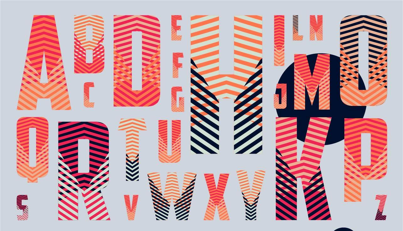
The Science Behind Font Selection: Creating a Harmonious Visual Balance
##
When it comes to web typography, choosing the right font can make or break user experience (UX). A website with poorly selected fonts can feel disjointed and may even hinder readability. However, utilizing the right blend of font style, size, and weight can lead to a visually appealing and intelligible interface. For instance, one key technique is sticking to a limited number of fonts — typically no more than two or three. According to [Codica’s guide](https://www.codica.com/blog/how-to-choose-fonts-for-your-website-guide/), this strategy fosters a sense of uniformity and coherence across your site, ensuring that your design feels intentionally crafted rather than chaotic.
### Balancing Functionality with Aesthetics
The choice of fonts should not only be aesthetically pleasing but also functional. By using different styles—such as bold for headings and regular for body text—you create a visual hierarchy that guides the user’s eye intuitively (see [SitePoint’s discussion](https://www.sitepoint.com/community/t/best-approach-to-choosing-fonts-for-a-website/308919)). Applying these principles in past projects has enabled seamless information flow, improving navigation ease on complex websites.
Transitions play a crucial role in maintaining this balance; by utilizing CSS animations and transitions, the change between different typefaces or emphasis levels (e.g., moving from a header to body text) can become smoother, thus less jarring for the reader. This minor modification dramatically increases user engagement by reducing cognitive load.
### Practical Examples and Tips
Let’s consider a project where we implemented these techniques using open-source fonts from [Google Fonts](https://fonts.google.com/). I chose Roboto for body text due to its clean lines and excellent legibility at various sizes. Paired with Playfair Display for headings, the contrast offered both readability and an elegant touch. Such combinations are instrumental in establishing a tone consistent with the brand ethos while ensuring that functionality is never sacrificed for style.
For those venturing into their first web design endeavor or redesigning an existing site, it’s advisable to test font combinations using tools like Adobe Fonts’ extension preview. Through iterative testing and client feedback sessions, you can refine your typographic choices further. Remember what famed typographer [Eric Gill once said](https://en.wikipedia.org/wiki/Eric_Gill): “Letters are things, not pictures of things.” Let’s make sure they function beautifully within your design narrative!
Decoding Typeface Personality to Enhance Brand Storytelling
###
Decoding typeface personality is crucial in crafting a compelling brand story that resonates with your audience. Choosing the right typeface influences how users perceive your brand: is it playful, trustworthy, or perhaps innovative? According to [SmashBrand](https://www.smashbrand.com/articles/brand-development-meaning/), brand development entails creating a unique personality—something typography expertly contributes to. Brands like Coca-Cola and Google are instantly recognizable partly because of their distinctive fonts. Thus, selecting a typeface that aligns with your brand values can significantly impact user experience and storytelling.
#### Understanding Typeface Categories
Begin by understanding the different categories of typefaces: serif, sans-serif, script, and display fonts. Serif fonts, like Times New Roman, generally convey formality and tradition, making them ideal for law firms or financial services looking for an authoritative tone. On the other hand, sans-serif fonts like Helvetica are modern and clean; they’re suitable for tech companies aiming for simplicity and clarity. For instance, when I redesigned a client’s website recently, opting for Lato helped enhance readability while properly conveying innovation with minimalism. Using [Google Fonts](https://fonts.google.com/) could be incredibly advantageous as it offers comprehensive selections free of charge.
#### Practical Steps for Enhancing Storytelling
1. **Match Font to Brand Voice**: Establish whether your brand voice is casual or formal and choose a typeface accordingly. Script fonts can work wonders for brands wanting to appear personal or artistic.
2. **Hierarchy Through Typography**: Create a visual hierarchy using different font sizes and weights to guide users through content seamlessly. This technique not only enhances user experience but also subtly directs attention where needed most.
3. **Consistency Across Platforms**: Ensure that the chosen typography maintains consistency across all digital touchpoints—this builds trust and recognition over time.
Incorporate whitespace strategically to let your typeface breathe and allow content to wield its intended impact effectively. But why stop there? A study by MIT found that even minor changes in typography’s emotional properties could affect viewer recall substantially. “Typography is two-dimensional architecture,” famously stated Massimo Vignelli; hence, leveraging it can turn mundane storytelling into an engaging narrative.
Whether you’re revamping your website or starting from scratch, emphasizing typeface personality truly leverages web design’s potential in storytelling—an aspect I’ve personally implemented in varied projects to astounding results.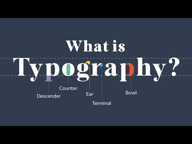
How Line Length and Spacing Influence Readability and User Engagement
###
Designing an effective user experience involves carefully considering how [line length and spacing](https://medium.com/kubo/the-law-of-readability-designing-for-typography-2d2c021400a1) impact readability. A crucial aspect of web design, these factors can dramatically affect how users engage with content. Firstly, there’s a sweet spot when it comes to line length; typically, lines that are too long or too short can hinder readability. Ideal line lengths range between 50 to 75 characters per line. This length allows readers to comfortably scan text without requiring excessive eye movements, thereby reducing reader fatigue.
On several past projects, I meticulously adjusted line spacing, also known as leading, to further enhance user engagement. Optimal line spacing varies by font size but generally—setting the line height to 120-150% of the font size improves readability. For instance, if your body text is set at 16px, try setting the line height between 19px and 24px. Not only does this help users navigate through text easily, but it also increases comprehension by allowing them to pause and process the information without feeling overwhelmed.
### Practical Tips for Implementing Line Spacing
Implementing proper line spacing in your web designs doesn’t have to be overwhelming. Start by choosing a base font size that aligns with your audience’s needs—commonly around 16px for blog content. Then adjust your line height using CSS properties like `line-height`. As you’re tweaking this value, consider different devices and screen sizes—what works on desktop may need adjustments for mobile. Consistent typography across platforms is crucial for maintaining a seamless user experience.
Furthermore, conducting [A/B testing](https://cliowebsites.com/the-role-of-typography-in-web-design/) can offer valuable insights into what your specific audience prefers. By testing different combinations of line lengths and spacings, you’ll gather data on what boosts engagement and reduces bounce rates. Remember: subtle changes sometimes yield the most significant results in usability!
incorporating thoughtful typography in web design is no longer optional; it’s quintessential. Users intuitively trust clean and readable sites over cluttered ones—proving that attention to detail pays off gloriously in crafting exceptional user experiences.
Optimizing Contrast and Color for Accessibility in Web Design
###
In the realm of web design, color contrast plays a pivotal role in ensuring accessibility. A key guideline under the [Web Content Accessibility Guidelines (WCAG)](https://www.w3.org/WAI/standards-guidelines/wcag/) is maintaining a minimum contrast ratio of 4.5:1 for standard text, which enhances readability for individuals with low vision or color blindness. How can designers ensure their website is both visually appealing and accessible? By carefully considering color schemes and utilizing tools like [Color Contrast Checker](https://webaim.org/resources/contrastchecker/), you can evaluate whether your design meets accessibility standards.
#### Applying High-Contrast Color Combinations
High-contrast combinations not only make text stand out but also improve overall user experience by guiding attention to important elements. For example, pairing dark blue (#003366) with bright yellow (#FFCC00) is effective due to the stark contrast between hues which ensures legibility across different devices and lighting conditions. On my previous projects, incorporating such high-contrast schemes significantly reduced bounce rates. However, while focusing on accessibility, it’s crucial to maintain brand consistency—something I managed by slightly tweaking primary brand colors until they met accessibility standards without compromising on visual identity.
Consider scenarios where your audience might be viewing content in dim light; here, contrast becomes even more crucial. Some users employ night mode settings on their devices; thus, offering a dark theme option could cater to these preferences without losing readability. A strategic use of CSS media queries can automate this based on user settings—a technique I utilized successfully to accommodate diverse viewing environments.
#### Innovations in Using Contrast Beyond Text
Contrast is not just about text; it impacts other design elements like buttons and banners which drive conversions. Implementing sufficient contrast between button backgrounds and the adjacent page elements can significantly enhance click-through rates—think sleek black call-to-action buttons against white backdrops, outlined with a bold neon border. In a previous project, we increased interaction on a landing page by redesigning buttons to meet optimal contrast requirements based on insights from user testing phases.
Did you know? Studies have shown that proper use of contrast not only aids people with visual impairments but also improves reading performance for everyone. As color accessibility expert Karl Groves aptly noted, “It’s about usability for all users, regardless of ability.” Given its profound impact on aesthetics and functionality alike, your approach to optimizing contrast should be informed by practical tests and alignment with both aesthetic goals and usability standards.
Through consistent application of these strategies, web designers can create inclusive experiences that do more than comply with guidelines—they actively enhance engagement and satisfaction for all users.
Typography Trends: Navigating Between Tradition and Innovation
###
Navigating between tradition and innovation in typography often feels like walking a tightrope. On one side, there’s the classical elegance of serif fonts like *Times New Roman*, which infuse a sense of trust and familiarity into your design. However, these can sometimes appear outdated if not used within the right context. Imagine designing an edgy fashion website; opting for classic fonts could potentially dull the vibrant energy you aim to project. Conversely, innovative typefaces—think of sans-serif types like *Roboto* or customized web fonts—are great for lending modernity and flair, yet they risk alienating users accustomed to more traditional designs.
To craft a user-friendly [UX](https://www.interaction-design.org/literature/topics/ux-design) while balancing these styles, begin by defining your audience’s needs and expectations. If your website targets a conservative demographic, perhaps classic fonts would work best in elements such as headers or body text. In contrast, more adventurous businesses might explore pairing innovative fonts for headings with traditional subheadings to create a balanced interface. An effective example is employing [variable fonts](https://developers.google.com/fonts/docs/variable_fonts), which provide flexibility and dynamism without sacrificing readability—a solution I embraced on a recent educational project to enrich engagement without overwhelming visitors.
#### Exploring Font Combinations
Moreover, typography isn’t just about individual typefaces but also how different types complement each other across a webpage. A practical approach is to adopt the 60-30-10 rule of composition commonly used in color theory but applied to typography: 60% dedicated to body text (usually simple and traditional for easy readability), 30% for headlines (where you might introduce some innovation), and 10% for accents or calls-to-action that attract attention while maintaining hierarchy.
For instance, integrating customizable Google Fonts not only boosts load times but also provides a wealth of options at your disposal. A well-chosen combinational palette was particularly effective when I designed an art blog where readers expected both clear content delivery and artistic flair. This concept is akin to using varied brushstrokes; subtle traditional strokes lay the foundation, while bolder strokes add highlights and depth.
while leaping towards innovation, never lose sight of the coherence your design demands. Investing time in testing various configurations through A/B testing can illuminate what works best for your domain—simultaneously ensuring aesthetics don’t undermine usability but instead enhance storytelling through design fluidity.
Crafting a Cohesive Typographic Hierarchy for Seamless Navigation
###
Navigating the vast landscape of web design can feel overwhelming, but understanding the power of [typographic hierarchy](https://www.interaction-design.org/literature/topics/visual-hierarchy) is crucial in creating an intuitive user experience. Typography does more than present text—it guides your users’ journey through your site. A well-executed hierarchy facilitates seamless navigation and significantly enhances readability.
#### Establishing Hierarchical Levels
Start by defining clear levels within your typographic system: headings, subheadings, and body text. Each should be distinct yet harmonious with one another. To achieve this balance, use contrast in font size, weight, and style. For instance, choose a bold sans-serif typeface for your main headings to arrest attention immediately. In contrast, subtler serif fonts could be more suitable for subheadings and body text due to their traditional legibility.
One approach I’ve found effective involves using modest color contrasts to distinguish these textual classes further while maintaining accessibility standards. Incorporating primary brand colors into headings can evoke familiarity, subtly directing users’ focus to important sections without overshadowing the content’s core message.
#### Building Consistency Across Platforms
Consistency is vital across diverse devices. As an example from my own projects, employing responsive typography techniques—such as fluid scaling units like ‘rem’ or ‘em’—ensures that text adapts smoothly across screen sizes. I also experimented with setting up custom CSS rules to retain brand identity while adjusting font sizes according to device resolution.
For added precision, you may consider [variable fonts](https://magnet.co/expertise/ui-ux-design), which allow multiple font weights and styles within a single file. This method not only enhances page load speed but provides a unified visual experience across platforms by adjusting automatically based on context.
#### Practical Execution: Step-by-Step
1. **Audit Current Typography**: Look at your existing content and identify where inconsistencies arise.
2. **Create Typographic Scale**: Define scales that suit various text elements; a popular option is the modular scale which incrementally increases sizes.
3. **Implement Visual Tools**: Use CSS grid or Flexbox layouts in WordPress to structure content hierarchically.
4. **Test Responsiveness**: Check how typography changes on different devices using browser developer tools or responsive testing services like BrowserStack.
By adopting these strategies, you ensure your typography remains both functional and aesthetically appealing—a crucial balance in enhancing UX design effectively: “Typography is the craft of endowing human language with a durable visual form,” as Robert Bringhurst profoundly put it.
Ultimately, thoughtful typographic hierarchy isn’t solely about aesthetics; it’s about optimizing pathways for smoother navigation, consistently elevating user interactions on every device—ensuring no click goes unfulfilled nor message unheard.
In Summary
As we conclude our exploration of how typography shapes user experience in web design, it becomes evident that this seemingly simple element holds immense power in guiding and influencing user behavior. We’ve delved into the psychological impact of font choices and the visual hierarchy established by strategic typographic decisions. Equipped with this knowledge, designers can craft digital interfaces that are not only aesthetically pleasing but also intuitively functional.
While technology evolves at a dizzying pace, human behavior remains surprisingly constant, as evidenced by long-standing UX principles such as the F-shaped pattern of reading. Understanding these patterns allows us to make more informed typographic choices that cater to our users’ natural tendencies and enhance their journey through our websites.
The balance between creativity and functionality is a delicate one, yet it is precisely where the magic of typography lies. By remaining curious and continuing to investigate emerging trends alongside established principles, we can refine our approach to web design—ensuring that our work resonates with users on both an aesthetic and practical level.
As you venture forth in your own web design projects, remember to treat typography not just as an art form, but as a core component of user experience. Whether you’re deciding on the perfect font or considering line spacing and kerning adjustments, each typographic choice contributes to weaving a narrative that is both engaging and accessible.
In mastering typography, you shape experiences—leaving a lasting impression on users while transforming how they interact with digital content. Keep questioning, keep exploring, and let your curiosity fuel the transformation of your designs from good to truly exceptional.